
ESEN
We design identities, interfaces and digital experiences that connect strategy, aesthetics and intent.
Project overview
Smuves — Visual identity and UX/UI system for a digital engineering platform
From technical software to a clear, modular and reliable digital experience.
Smuves is a robust platform for data engineering, optimisation and large-scale web-content migration. The challenge was to turn a code- and engineering-led tool into an intuitive, appealing and trustworthy digital experience.
The project brought together identity, visual narrative, interface design and a modular component library to explain complex software with more order, precision and clarity.
The challenge
Turning technical complexity into an intuitive experience.
Smuves needed a human face and a refined interface to communicate order, security and advanced technology from the first interaction.
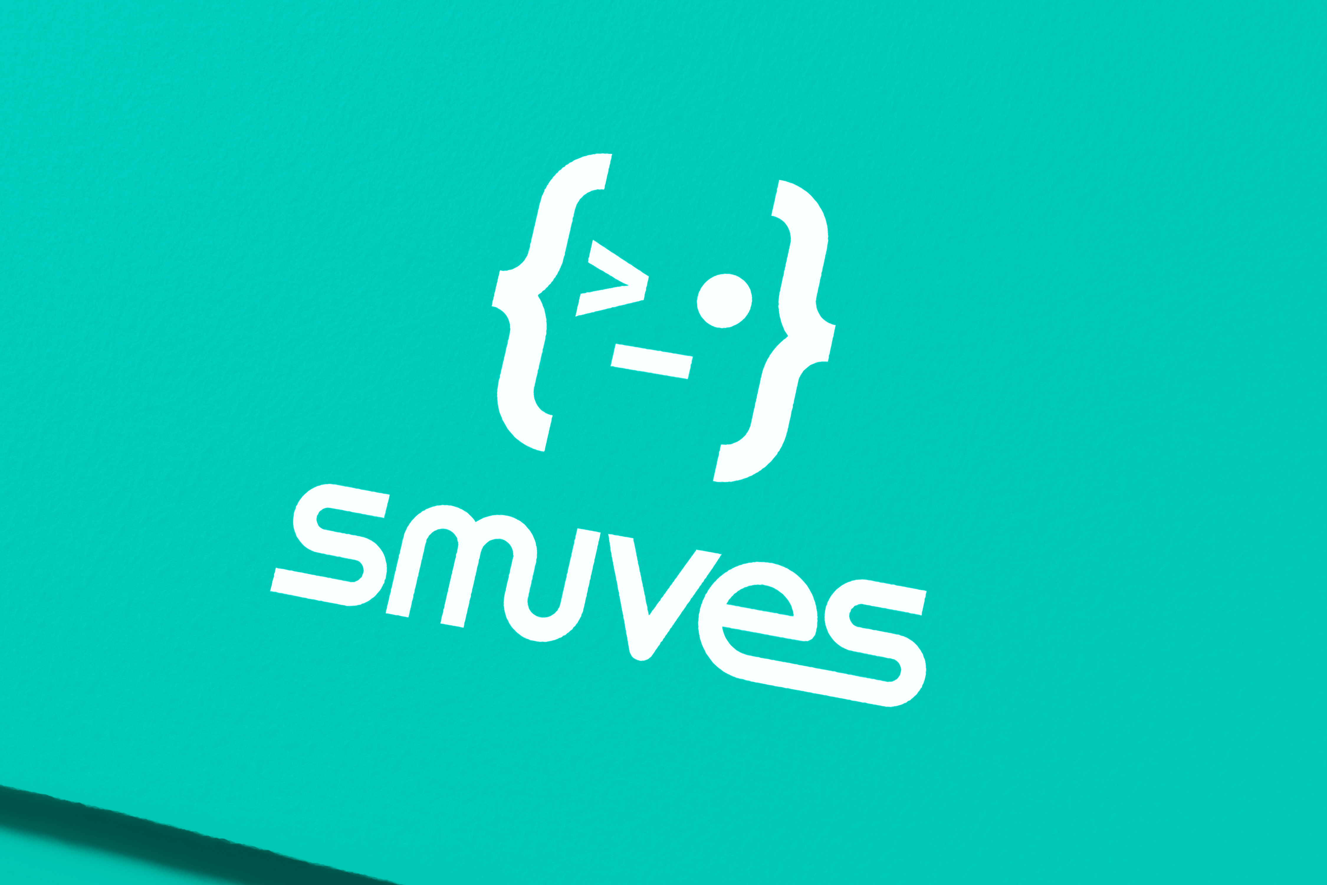
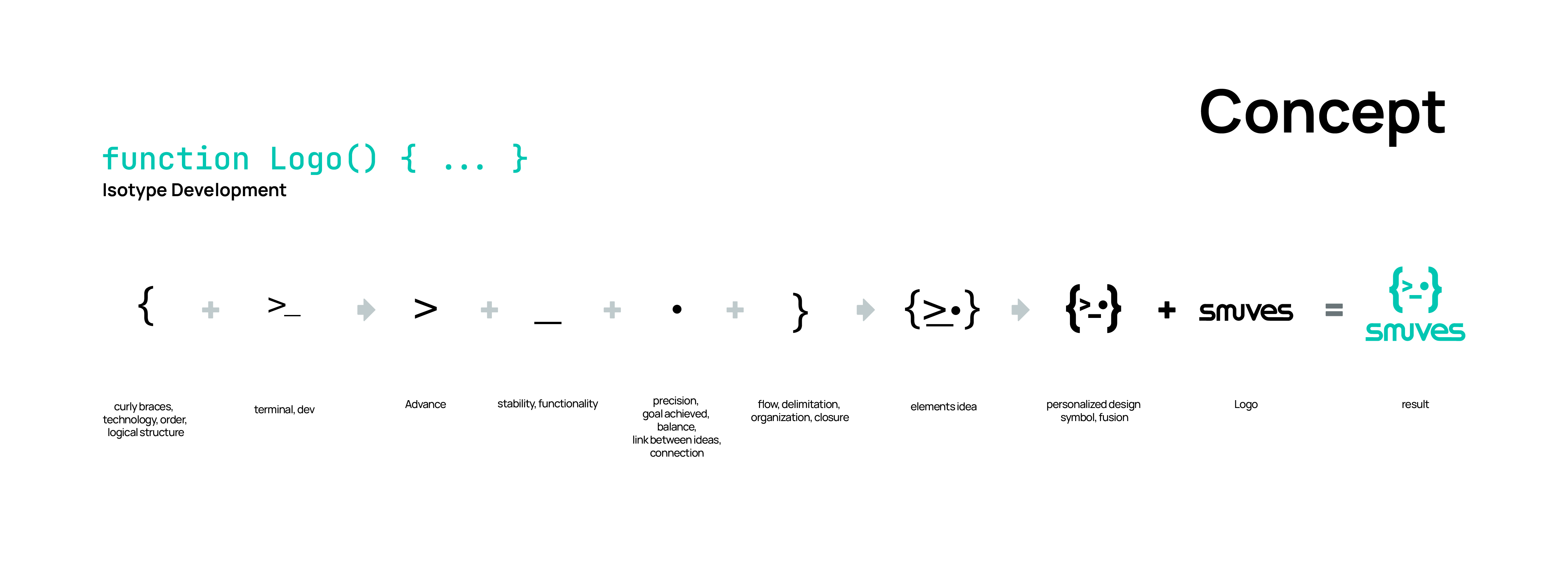
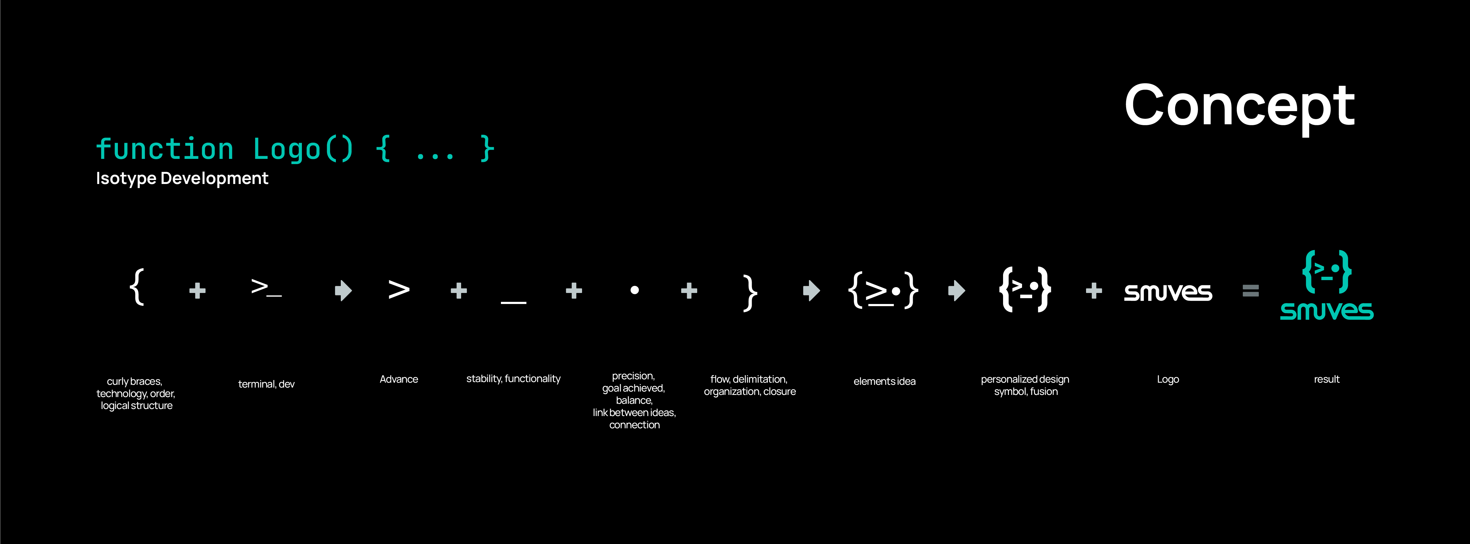
We built a symbol inspired by the logic of code and programming languages: a geometric form born from the developer world and shaped into a clear, recognisable visual asset with its own identity.
The challenge was not simply to design an appealing website. It was to translate a code- and engineering-led tool into a digital experience that felt understandable, scalable and reliable.
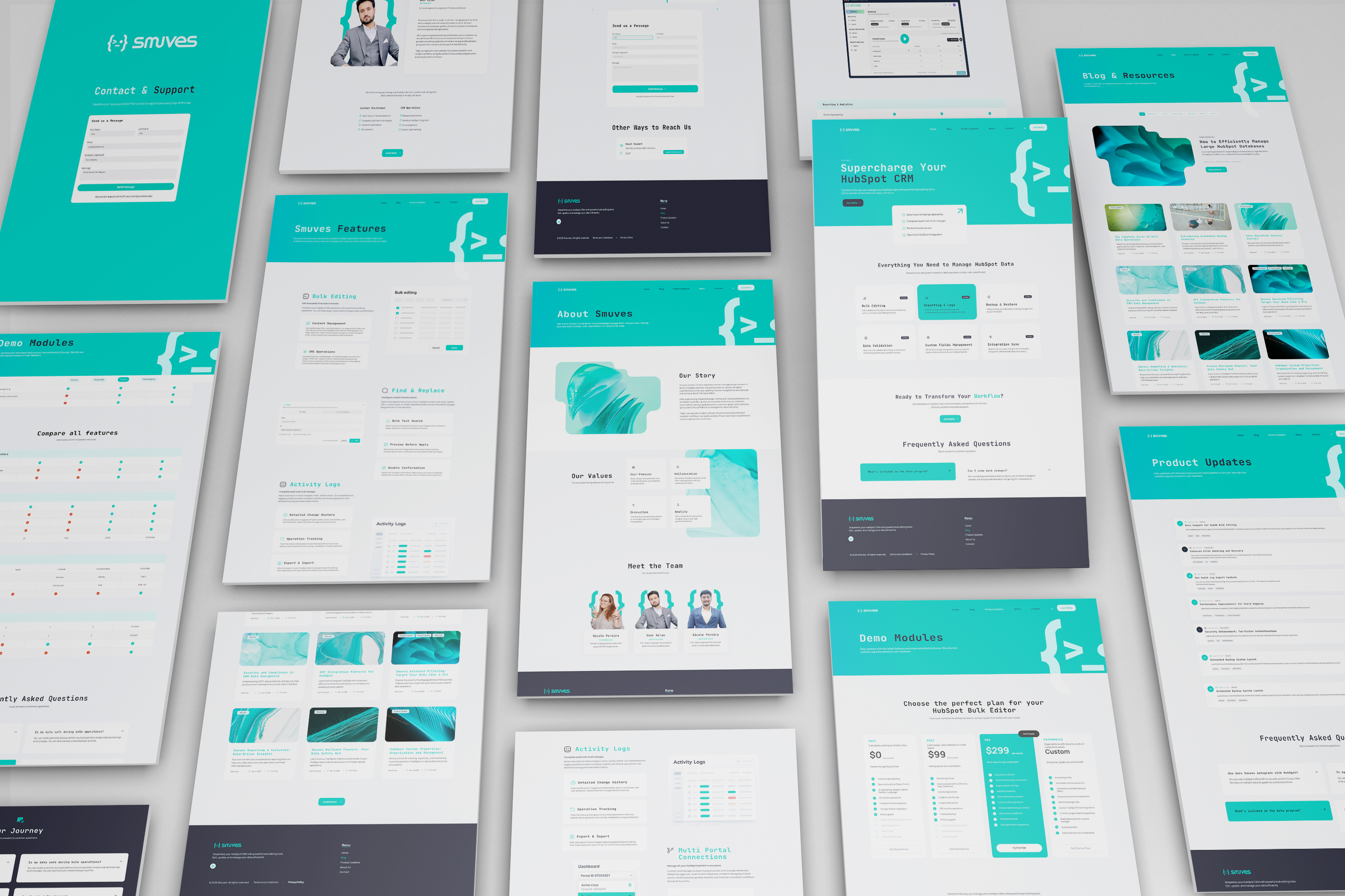
Rather than designing a set of fixed pages, we developed a scalable modular system through a living component library.
Each piece was structured around four principles: speed, visual consistency, legibility and technical accessibility. The same module can work across multiple scenarios: centred, split, minimal or information-rich layouts.
Our approach
A component system, not a static website.
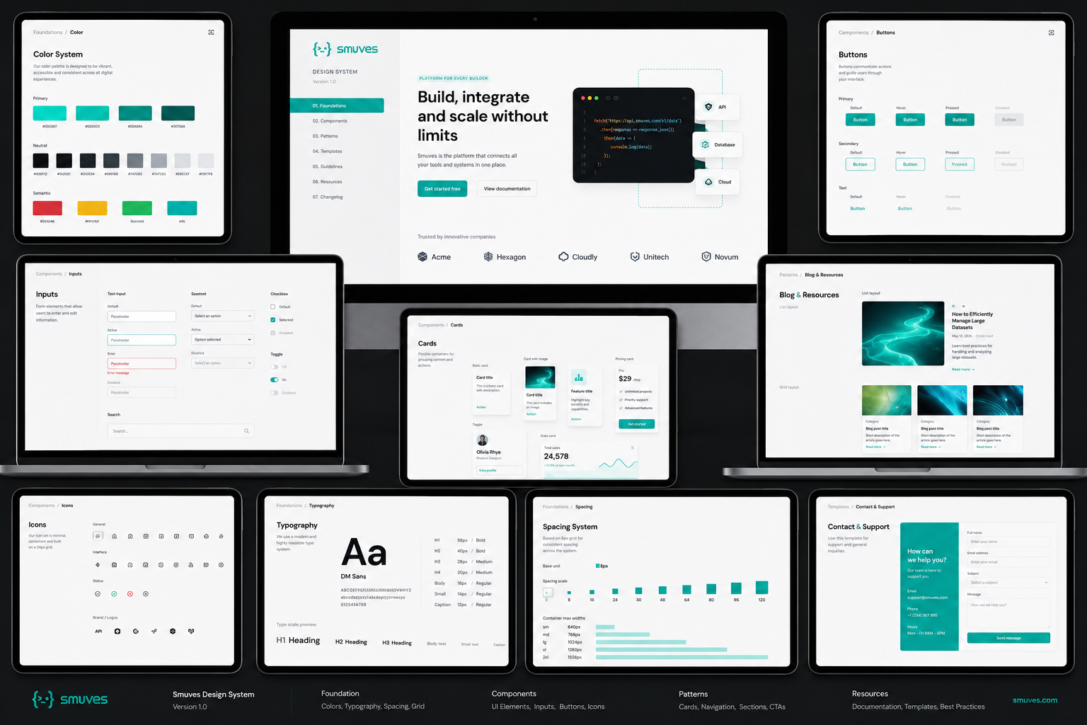
Icon grids
Image containers
Lead-capture modules
FAQ blocks
Conversion banners
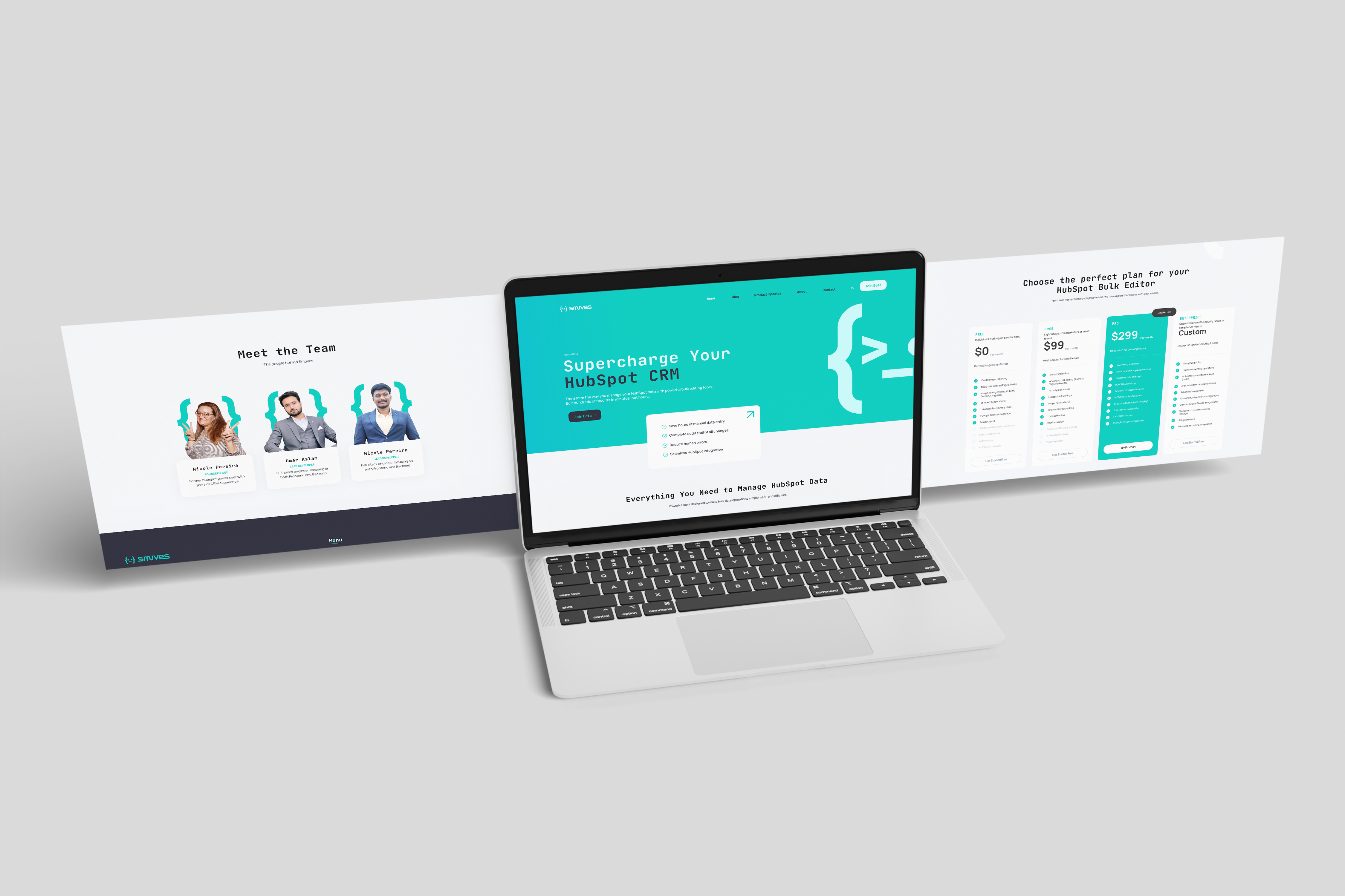
Digital ecosystem
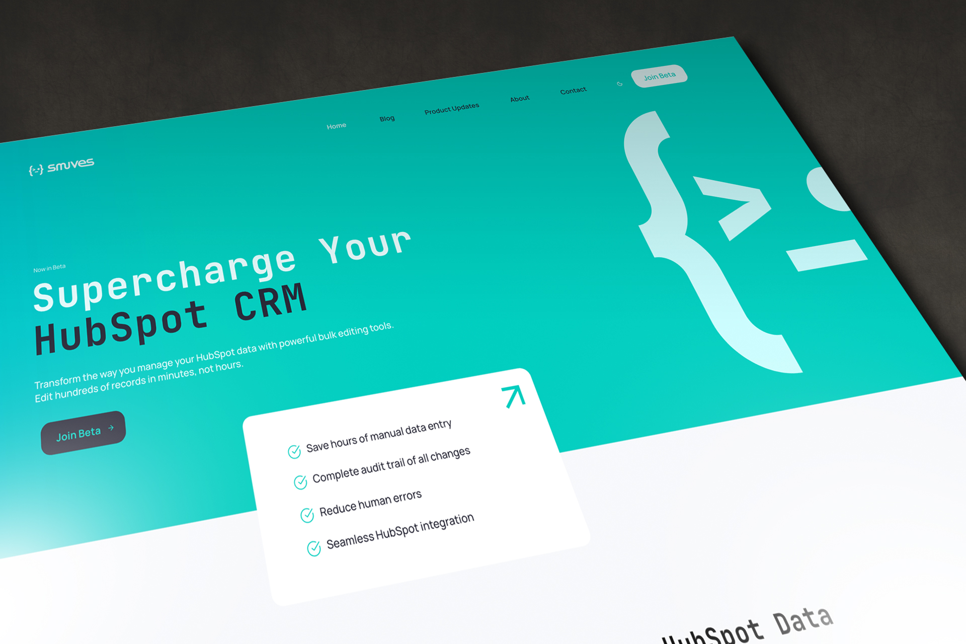
A flexible website built to explain, convert and scale.
Logo evolution
A visual narrative in motion.
The logo process began with a more open, expressive exploration, looking for a visual signature that could convey flow, connection and the feeling of a system in motion.
From there, we refined the construction into a more solid, technological language: better rhythm between letters, greater legibility and a stronger presence across interface, brand and digital system.
A freer, more organic first direction, built from a continuous gesture to express closeness, fluidity and movement.
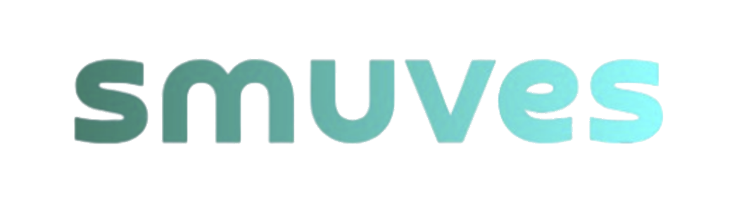
The form gains weight, contrast and precision. We adjusted curves and apertures to make it more legible, technological and stable.

The result consolidates a clearer, more scalable identity: a contemporary brand with digital energy and its own presence.
Identity in use
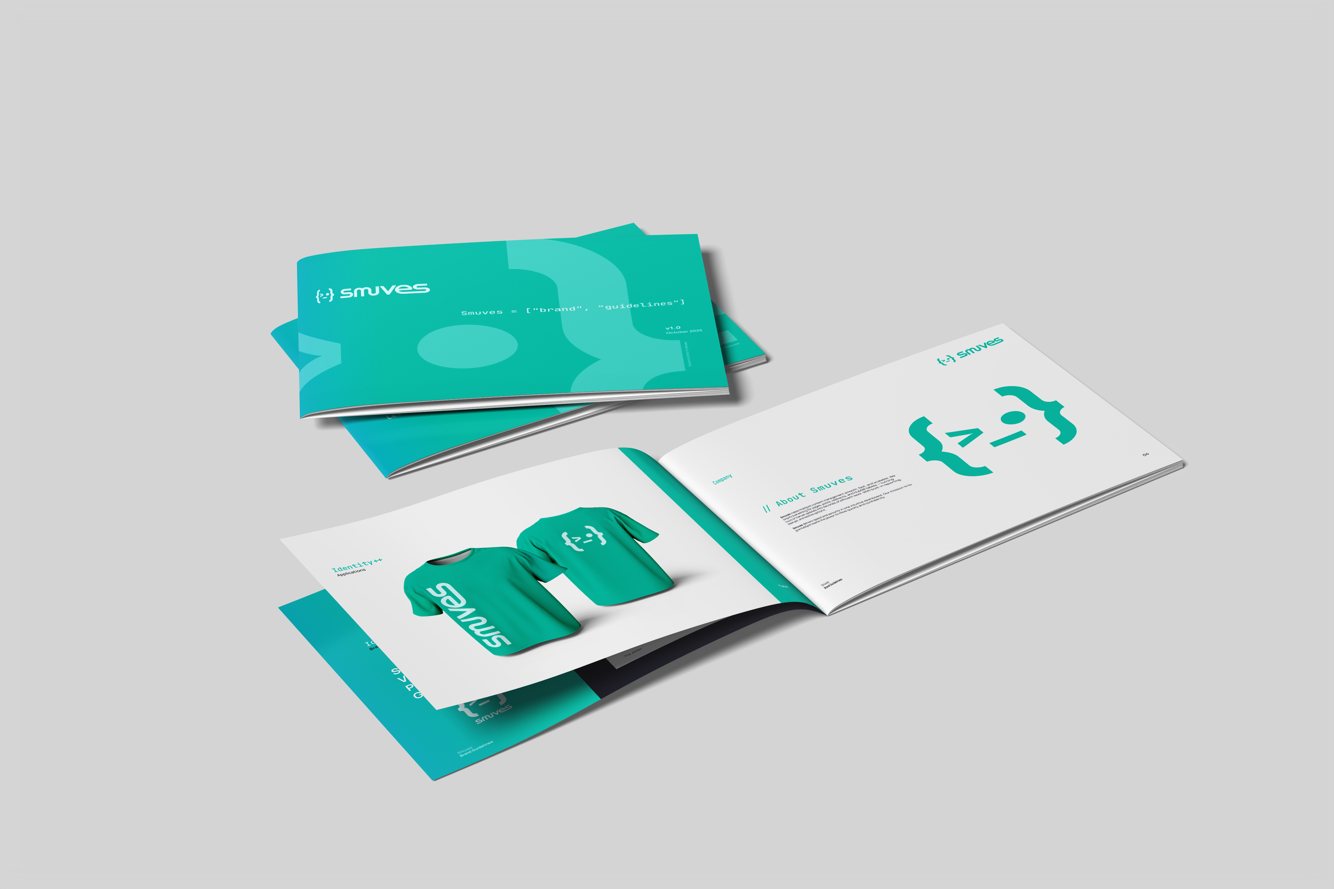
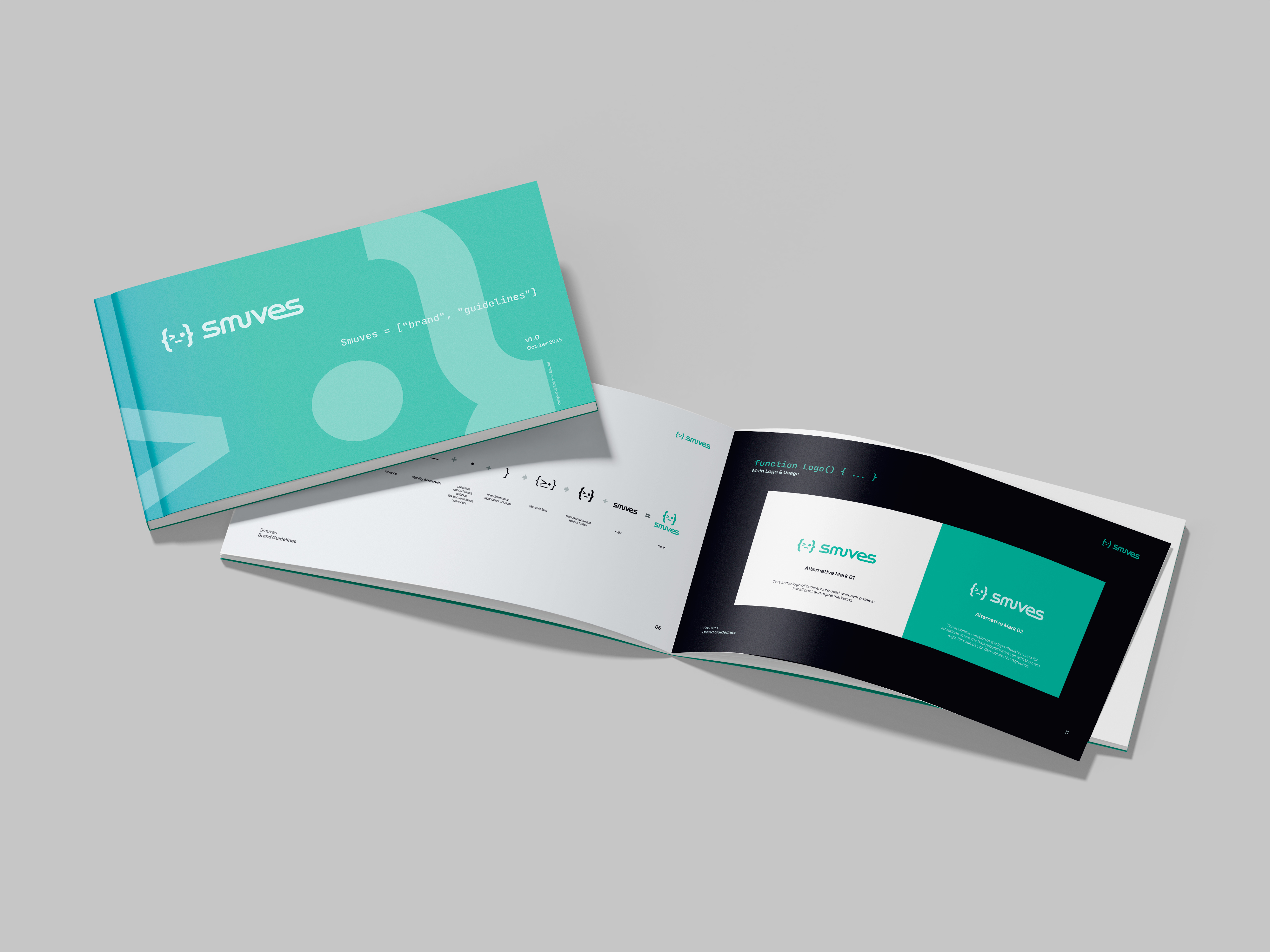
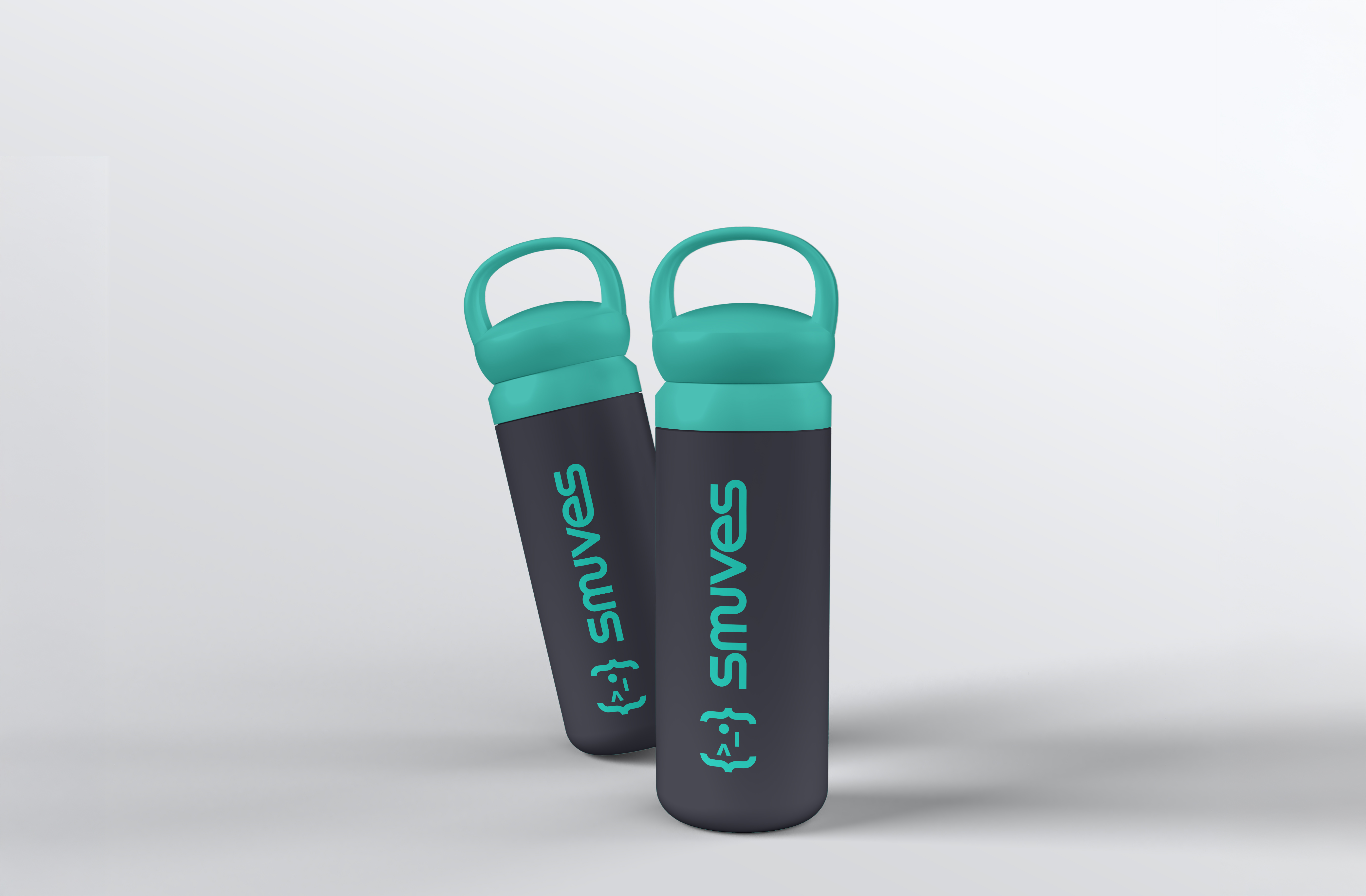
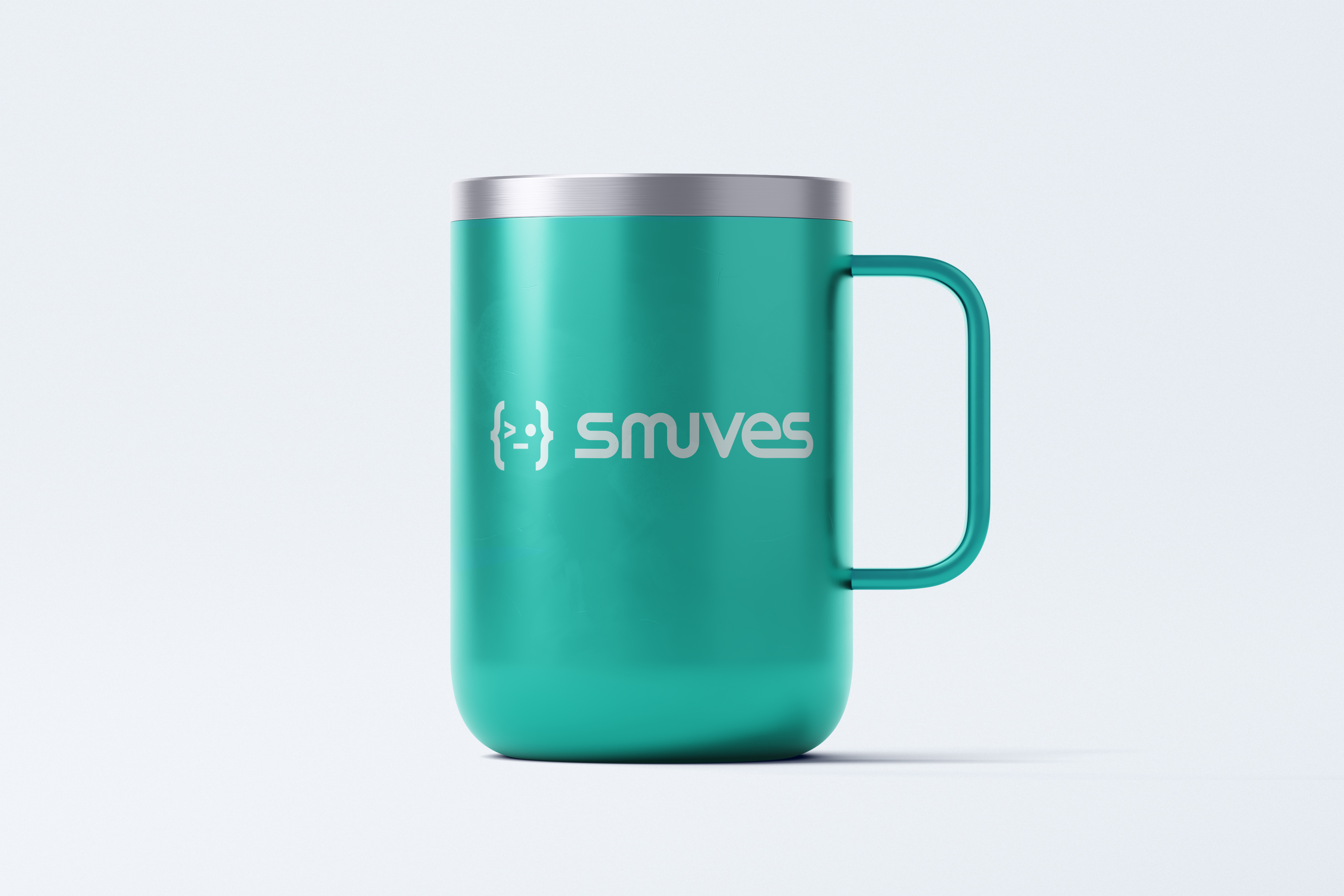
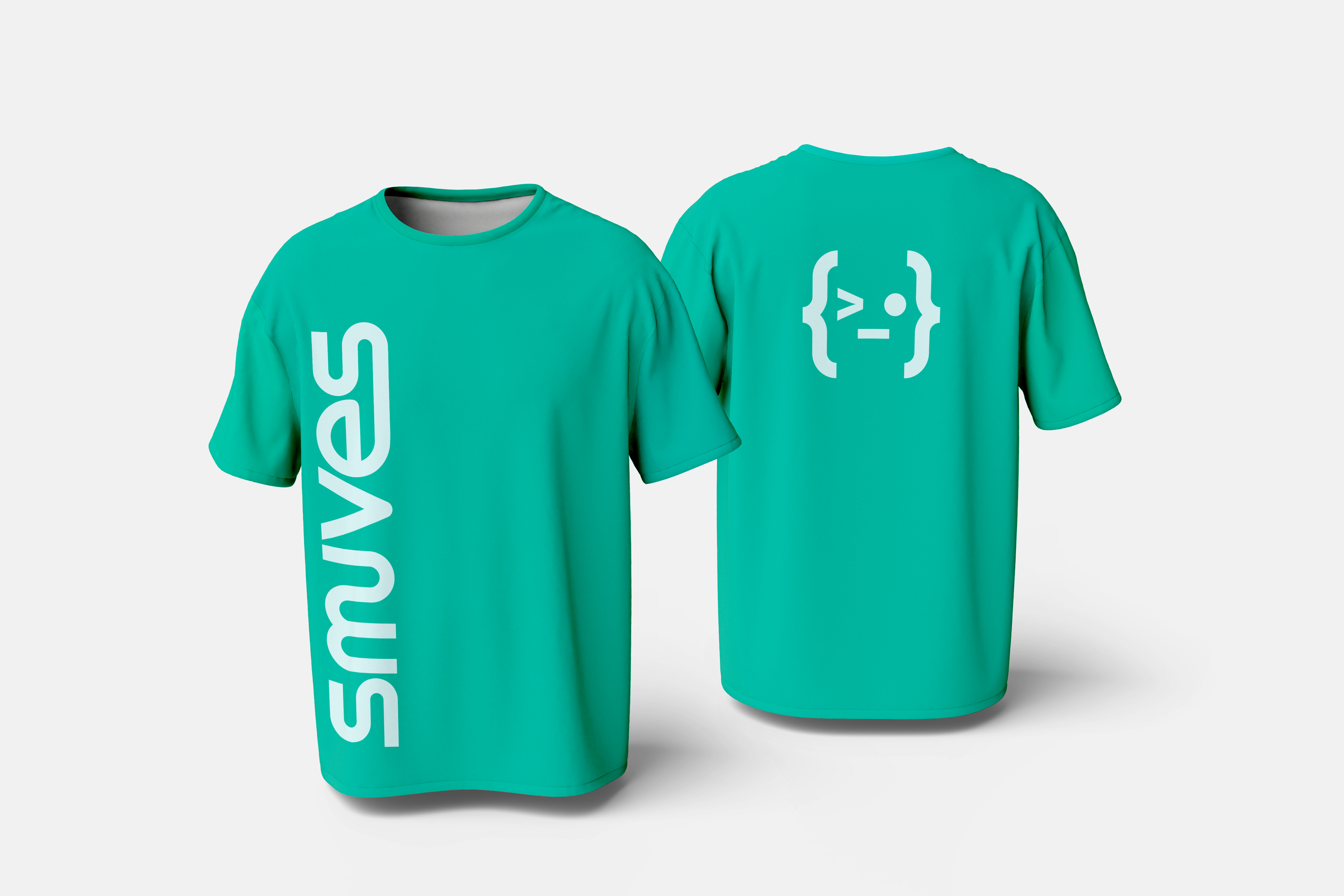
A technical brand with tangible presence.
A product ready to compete
A product ready to compete in the technology sector.
Visual identity and brand character
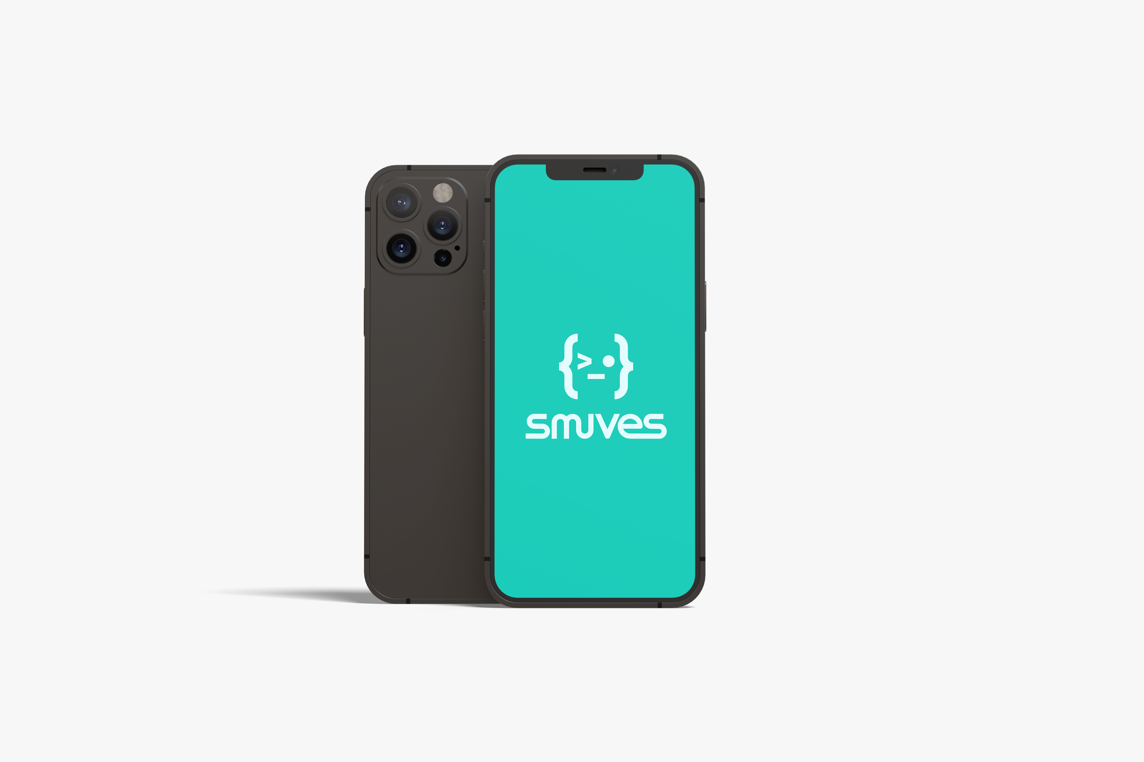
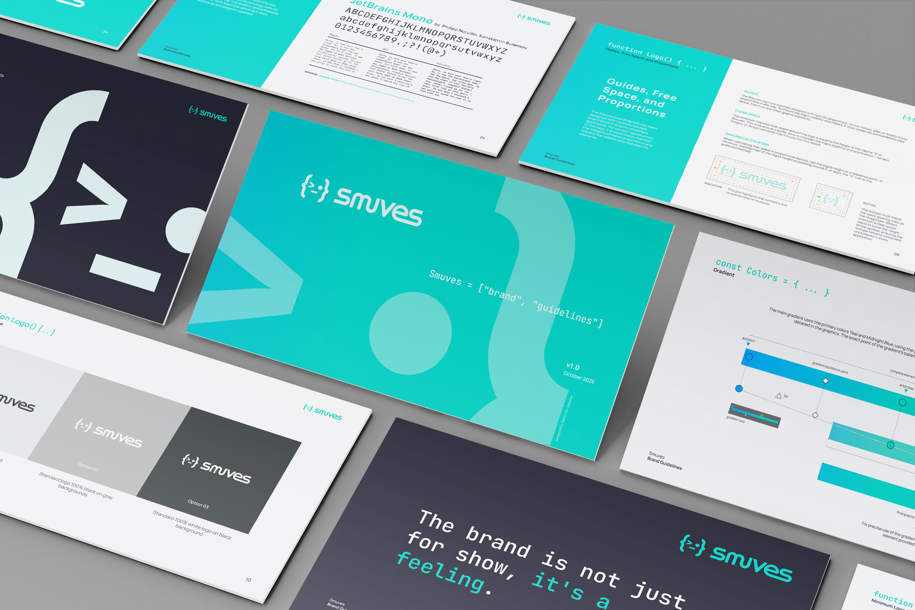
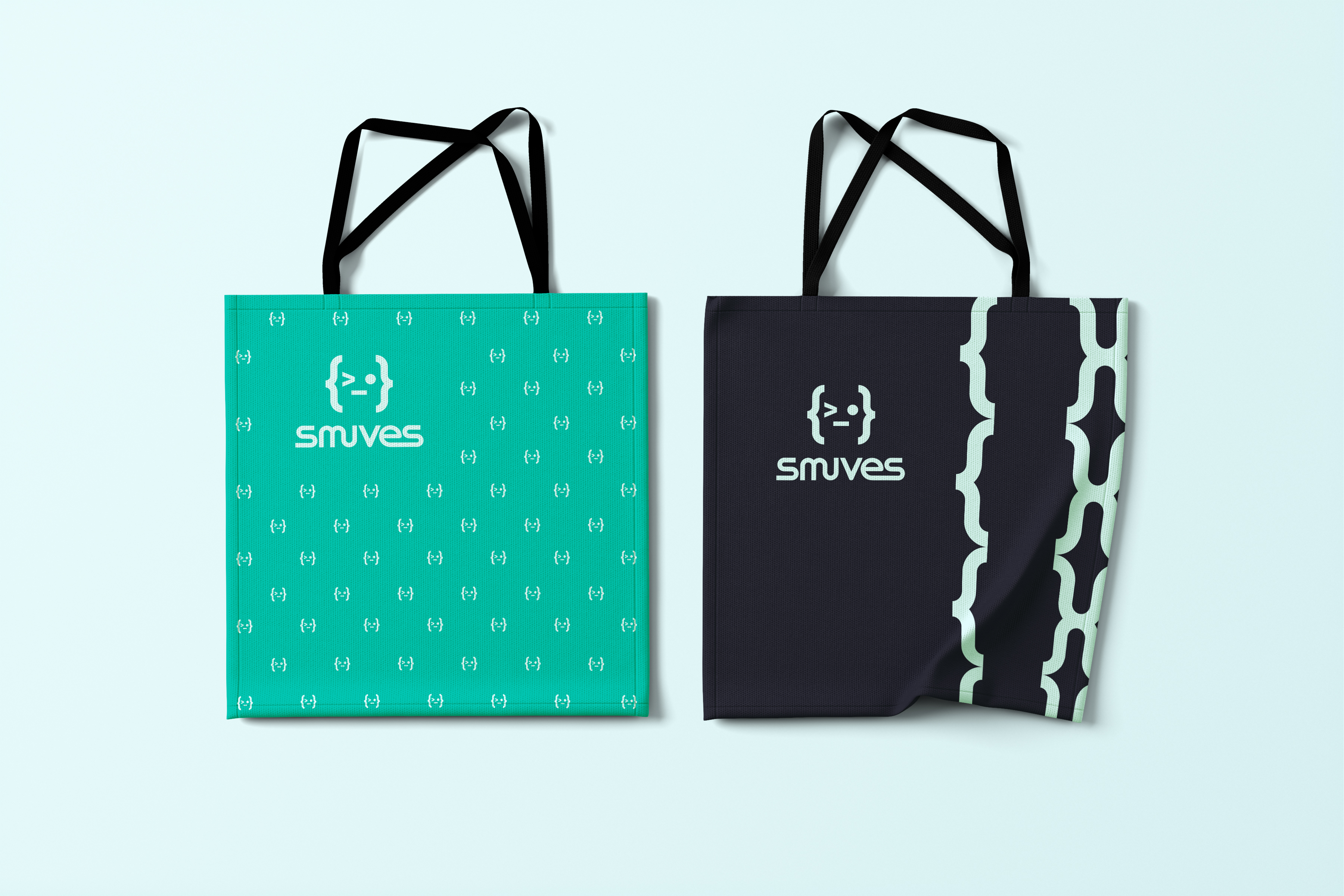
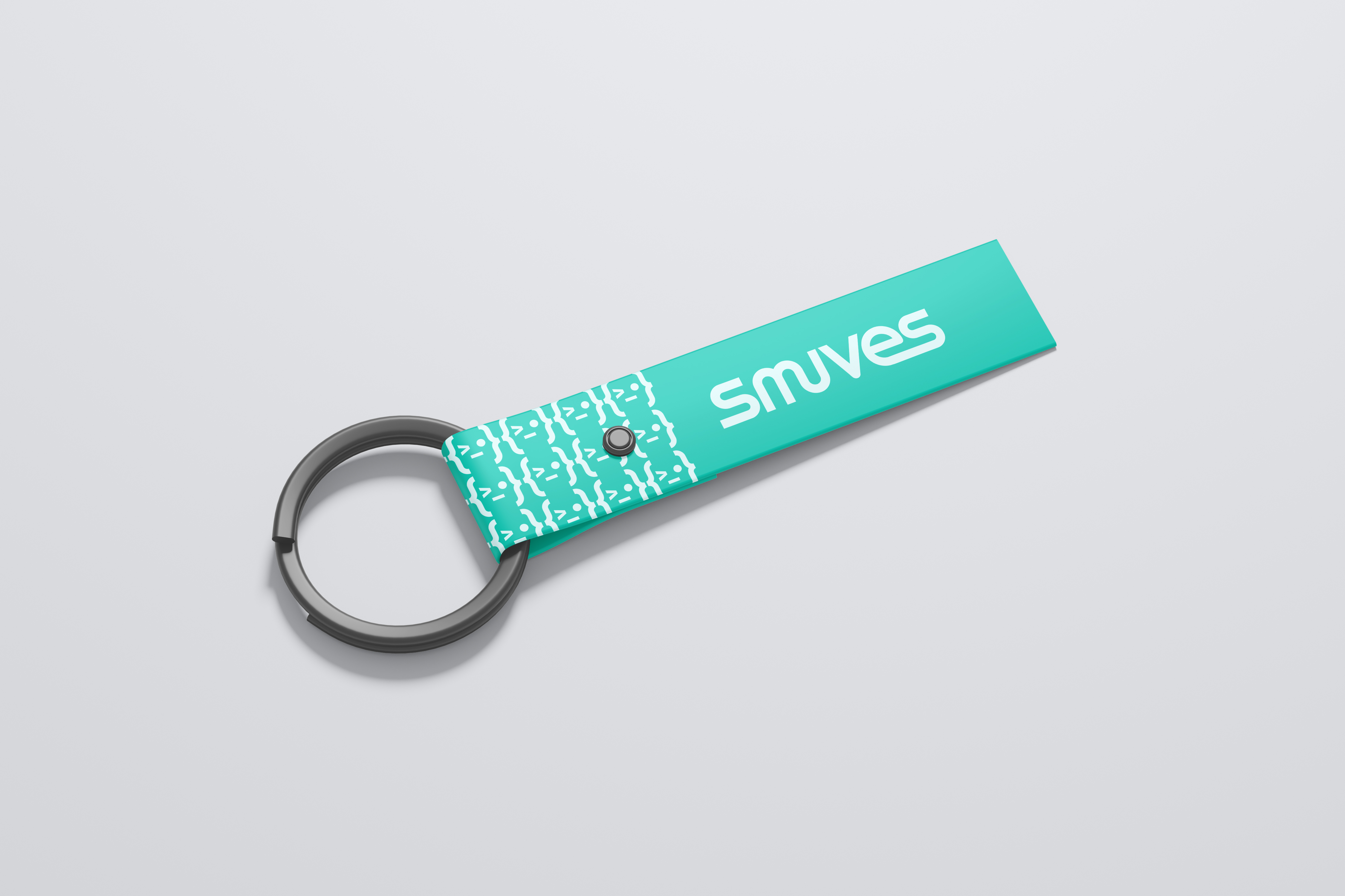
We developed a flexible identity system designed to express the brand clearly across different contexts. It brings together a wordmark, an independent symbol and a combined version, allowing the identity to adapt across digital media, print, interfaces and brand applications without losing coherence.
Within this visual universe, Old Winky emerges: a mascot created from code elements: {>_•}. Its form comes from terminal language, turning a technical resource into a distinctive, direct character with its own attitude.
Old Winky has a dry, unflappable and slightly ironic personality. It does not try to appeal to everyone; it speaks to people who understand the developer world.
Its presence brings warmth, character and memorability, becoming a distinctive brand element without ever feeling forced.
Services delivered
Corporate branding, logo design, UI, UX, design-system architecture and motion direction.
Tools
Figma, Adobe XD, Protopie, Adobe Illustrator and Adobe Photoshop.
A product with direction
Let’s design a digital ecosystem that can grow with you.
If your product needs clarity, structure and a strong visual identity, we can turn complexity into a simpler, more memorable and trustworthy experience.
Let’s talk about your project