A premium, strategic visual language
Move the brand toward a more current, technological and dynamic aesthetic aligned with contemporary digital expectations.

We design identities, interfaces and digital experiences that connect strategy, aesthetics and intent.

From an HR tool to an HR Tech brand with a distinct presence.
Evaluar is a platform specialising in Human Resources solutions: psychometric assessments, ATS, artificial intelligence and talent analytics.
The project evolved its visual presence into an identity that feels more modern, clear and scalable. At LIMINAL, we worked across logo redesign, visual identity, brand system, UX/UI design and web experience to create a more technological, human brand ready to grow.
Evaluar already had technology with enormous potential, but it needed a brand able to express that ambition.
Our direction was to shape a more vivid, clear and innovative identity without losing its essence: assessment, trust, growth and progress.
The goal was not simply to redesign a brand, but to build a visual system capable of supporting product, communication, marketing and digital experience.

Evaluar had built a visual track record over the years. In 2014, the brand had already made an important shift: becoming simpler, more approachable and recognisable. But the company’s digital evolution called for more.
The redesign needed to move the brand toward a more modern, flexible and expressive language. We introduced violet, purple, amaranth and gradients to build an identity with greater energy, movement and digital presence—without losing clarity or trust.
The logo evolution begins with the letter “V”. From there, we built a symbol that brings together assessment, approval, people, growth, innovation and movement.
The result is a more dynamic, legible brand: a sign of progress that preserves Evaluar’s essence while making it more current, technological and ready for digital contexts.
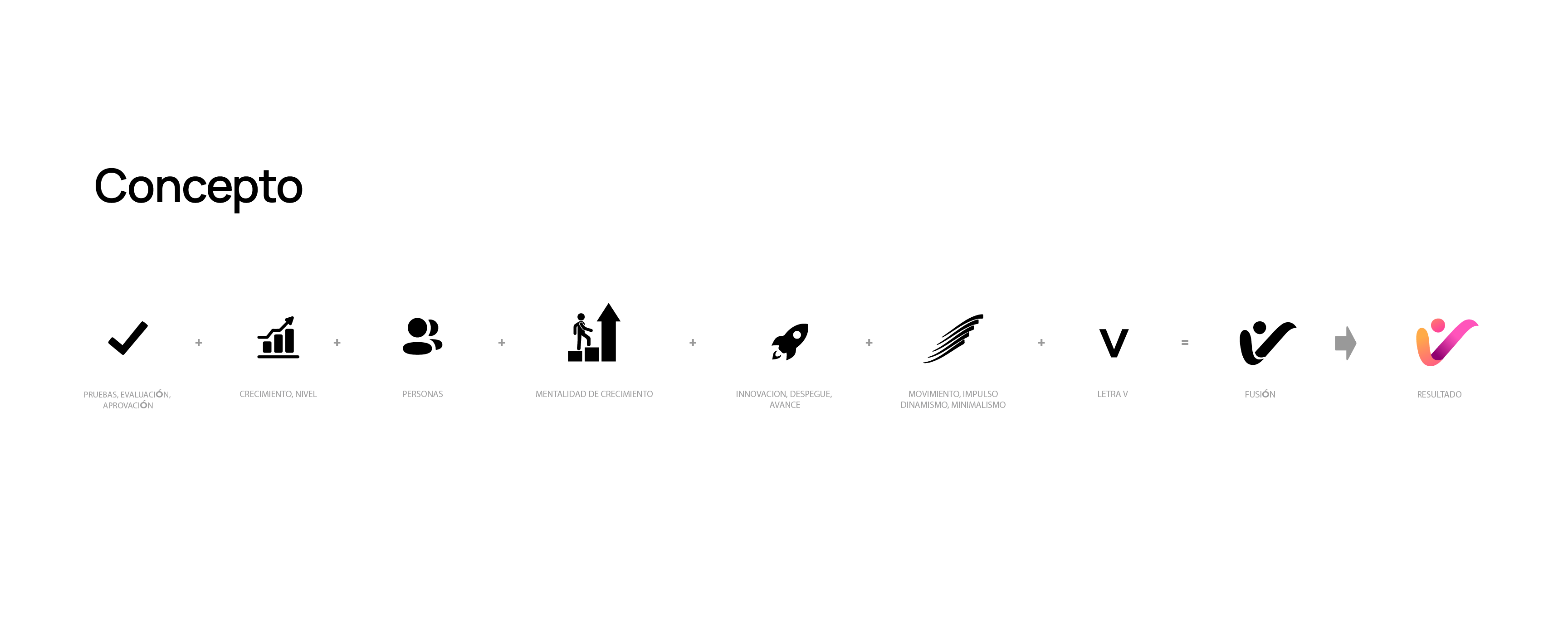
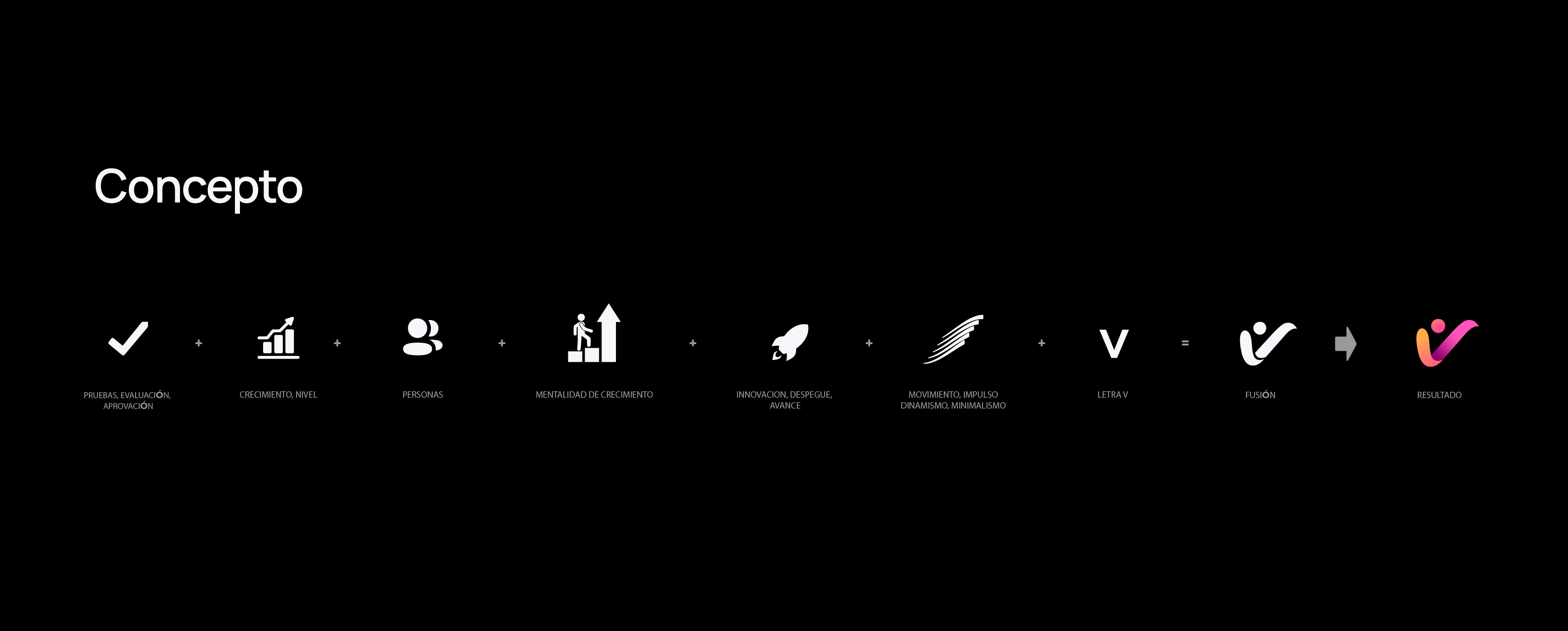
The redesign distils the brand into a recognisable idea: assess, validate and advance. The V works as a point of approval, an upward direction and a human gesture within a technological system.
The relationship between the symbol and wordmark protects proportion, legibility and consistency across interfaces, print, presentations, advertising and corporate applications.
Evaluar’s identity already had a history. Each stage sought to express growth, solutions and technology through different visual languages.
Our work was to organise that evolution and carry it into a more current, coherent and memorable system.

The brand began with a functional need: explain HR tools and solutions. Its visual language was direct, descriptive and focused on communicating the service.

The identity began to articulate a clearer idea of progress. The ascending arrow connected assessment with growth, advancement and continuous improvement.

This marked a more visible visual shift. The brand became simpler, more recognisable and more contemporary — the first step toward a stronger identity.

The redesign turns the brand into a more expressive, current visual system. Violet, purple, amaranth and gradients bring colour, movement and energy to a more technological, human digital presence.

The palette combines a blue and violet base—associated with security, technology and data—with fuchsia, orange and yellow accents that bring warmth, dynamism and human closeness.
The visual system balances technical precision with a more approachable, vivid and accessible feeling.
The new identity was designed to live beyond the logo. We built a visual language for presentations, commercial materials, interfaces, advertising, digital content and corporate communications.
The result is a more consistent, recognisable brand ready to communicate with strength across different touchpoints.
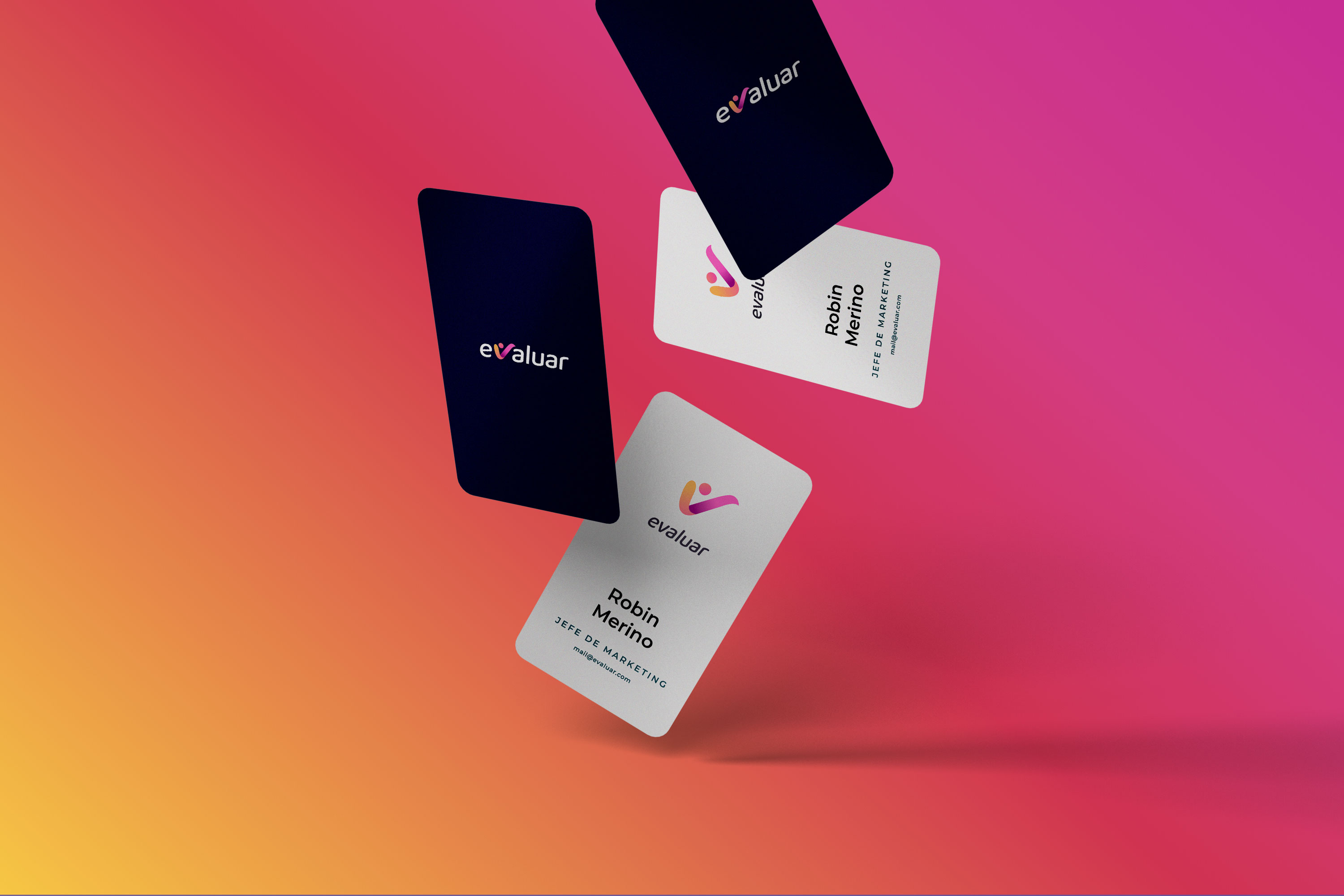
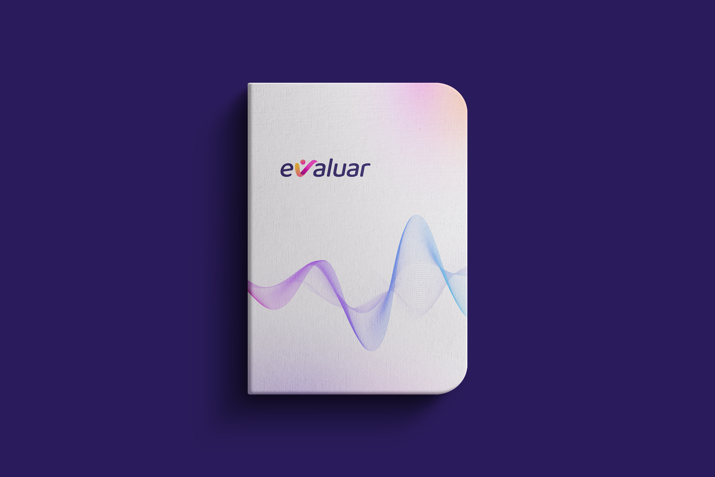
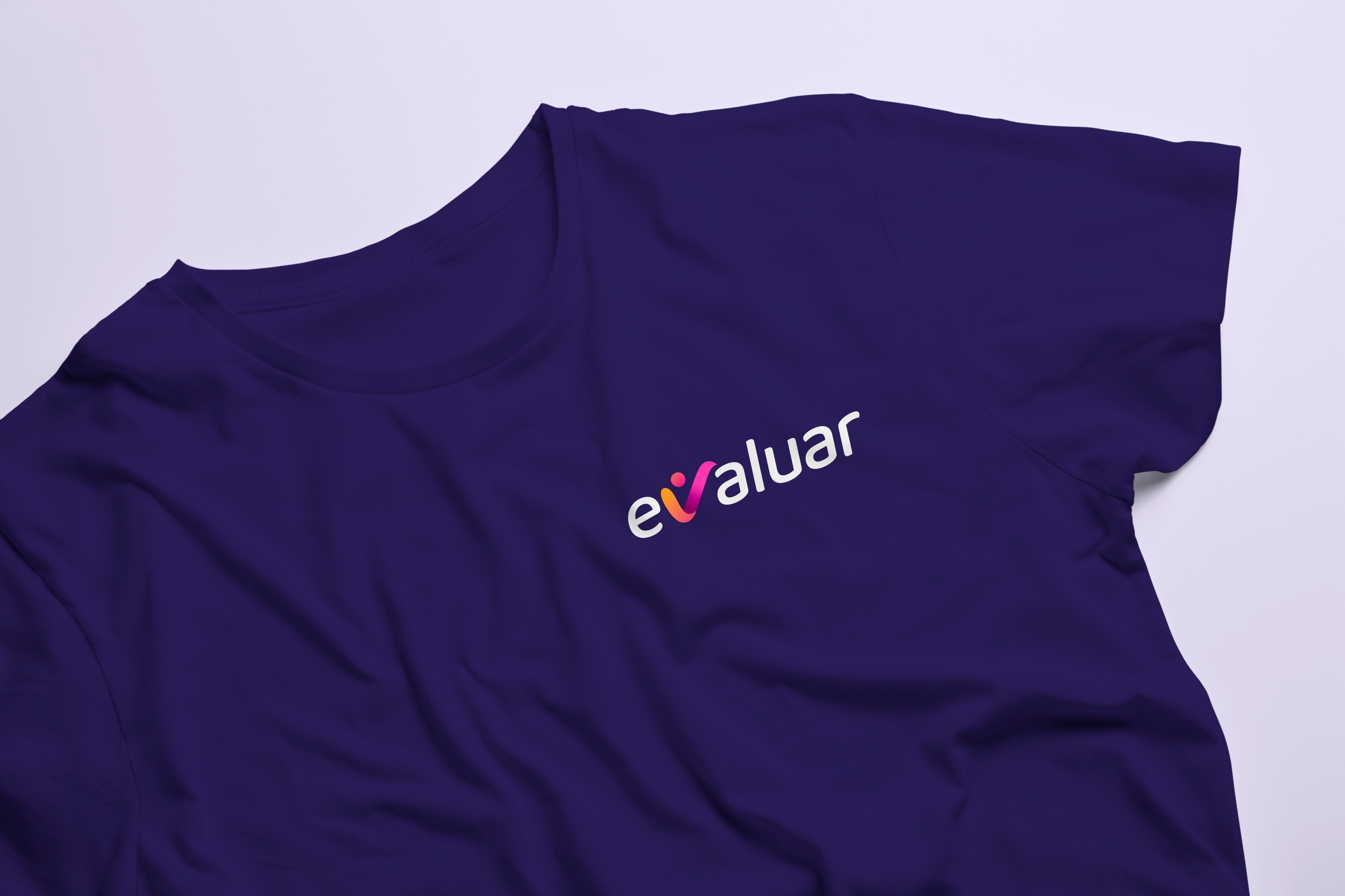
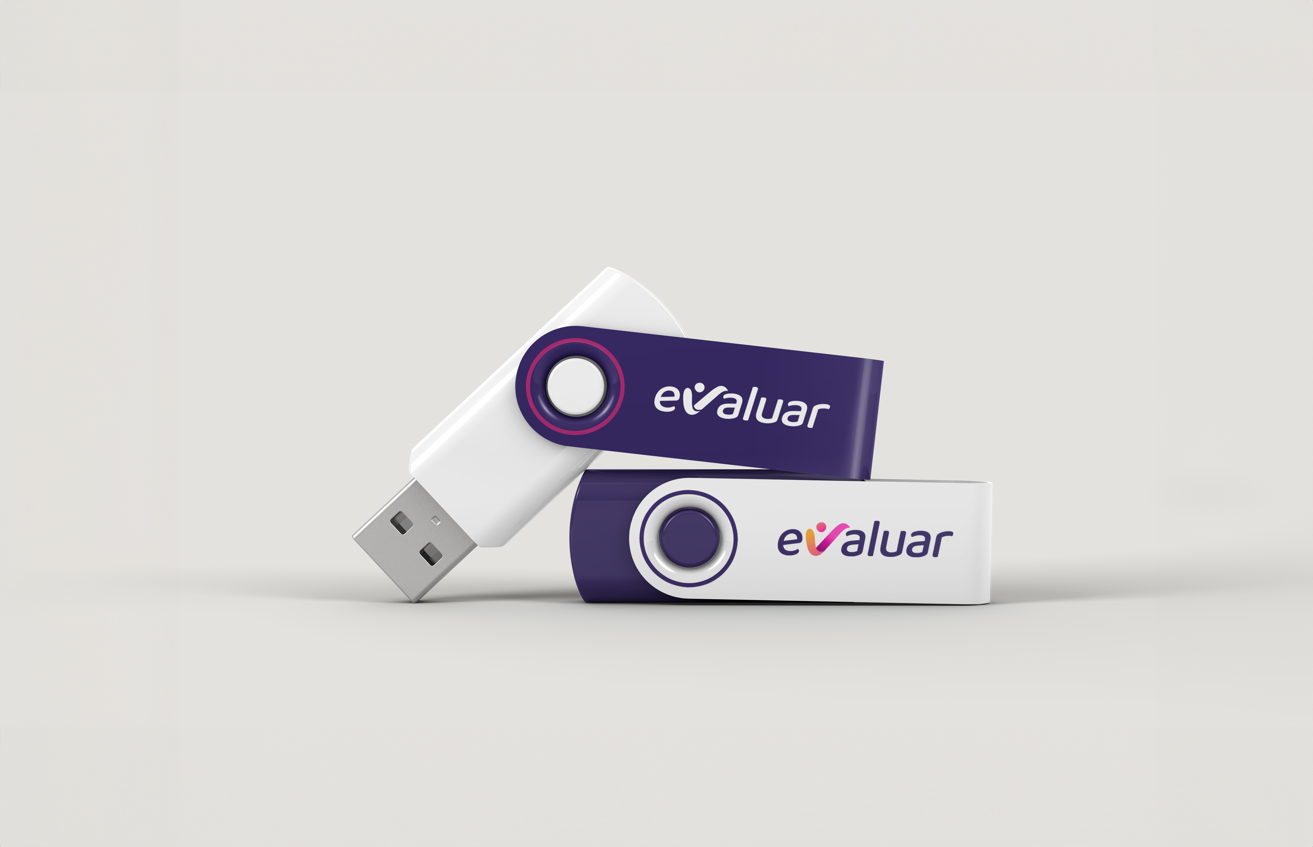
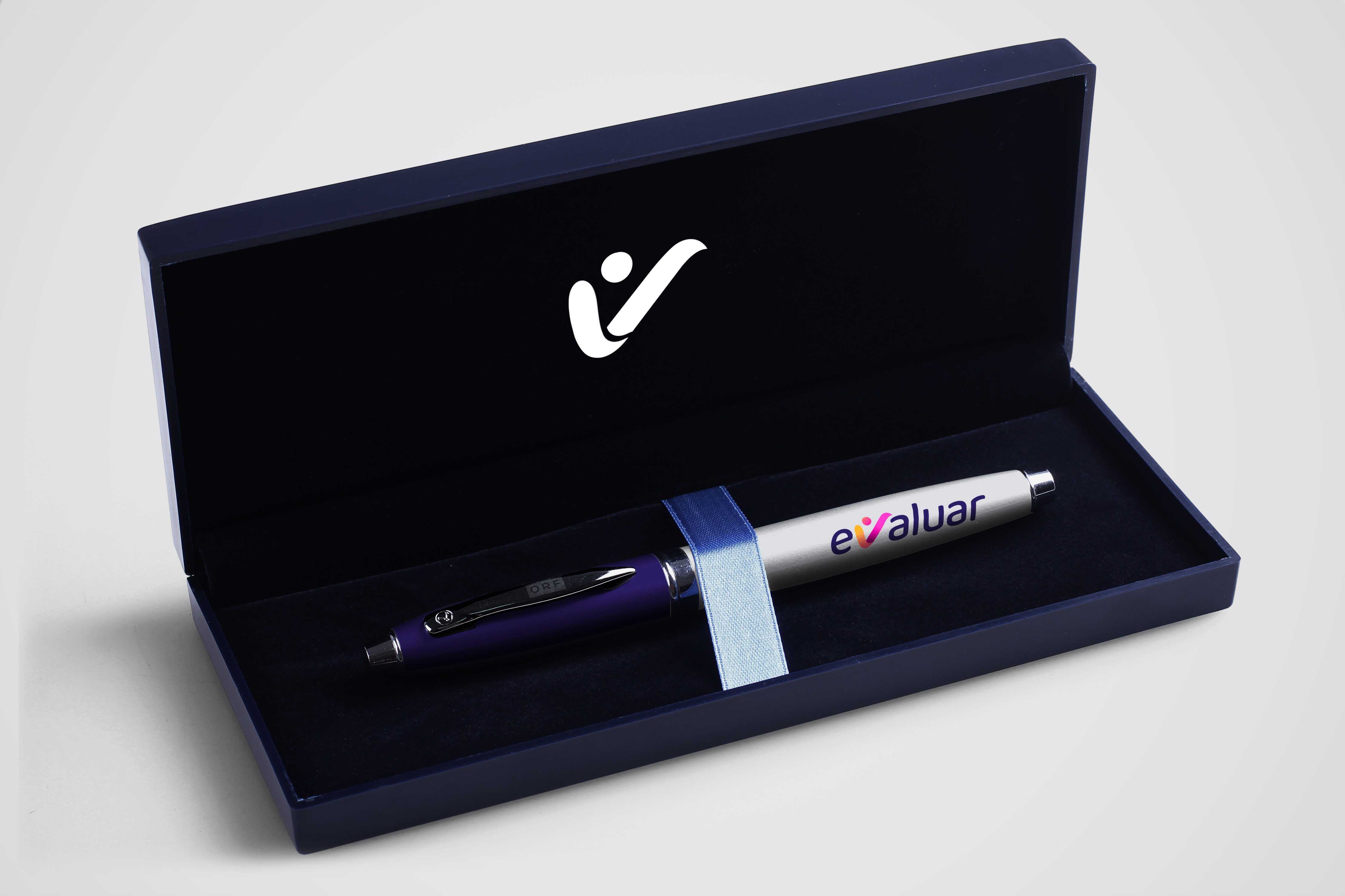
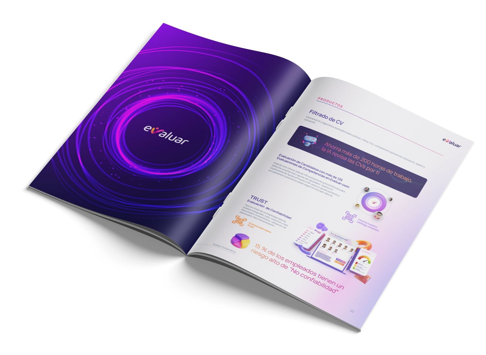
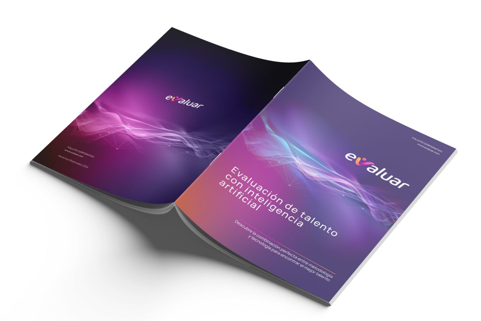
We redesigned the logo around the “V” as its central device: geometric, dynamic and upward-moving.
We defined versions, correct usage, minimum sizes, colour palette, typography and visual principles.
We created a modular component library to keep buttons, forms, states, labels and digital interfaces consistent.
We shaped architecture, flows and interface to explain ATS, assessments, AI and analytics with greater clarity.
The greatest challenge was turning a complex platform into a brand that is easy to understand and remember.
At LIMINAL, we worked to ensure the technology did not feel cold or generic, but clear, human and visually compelling.
We built a documented visual system with reusable components, variants, interactive states and clear rules to support new interfaces without losing coherence.
Manrope helped balance technical precision with more approachable, readable geometric forms, reinforcing a clearer and more consistent experience.
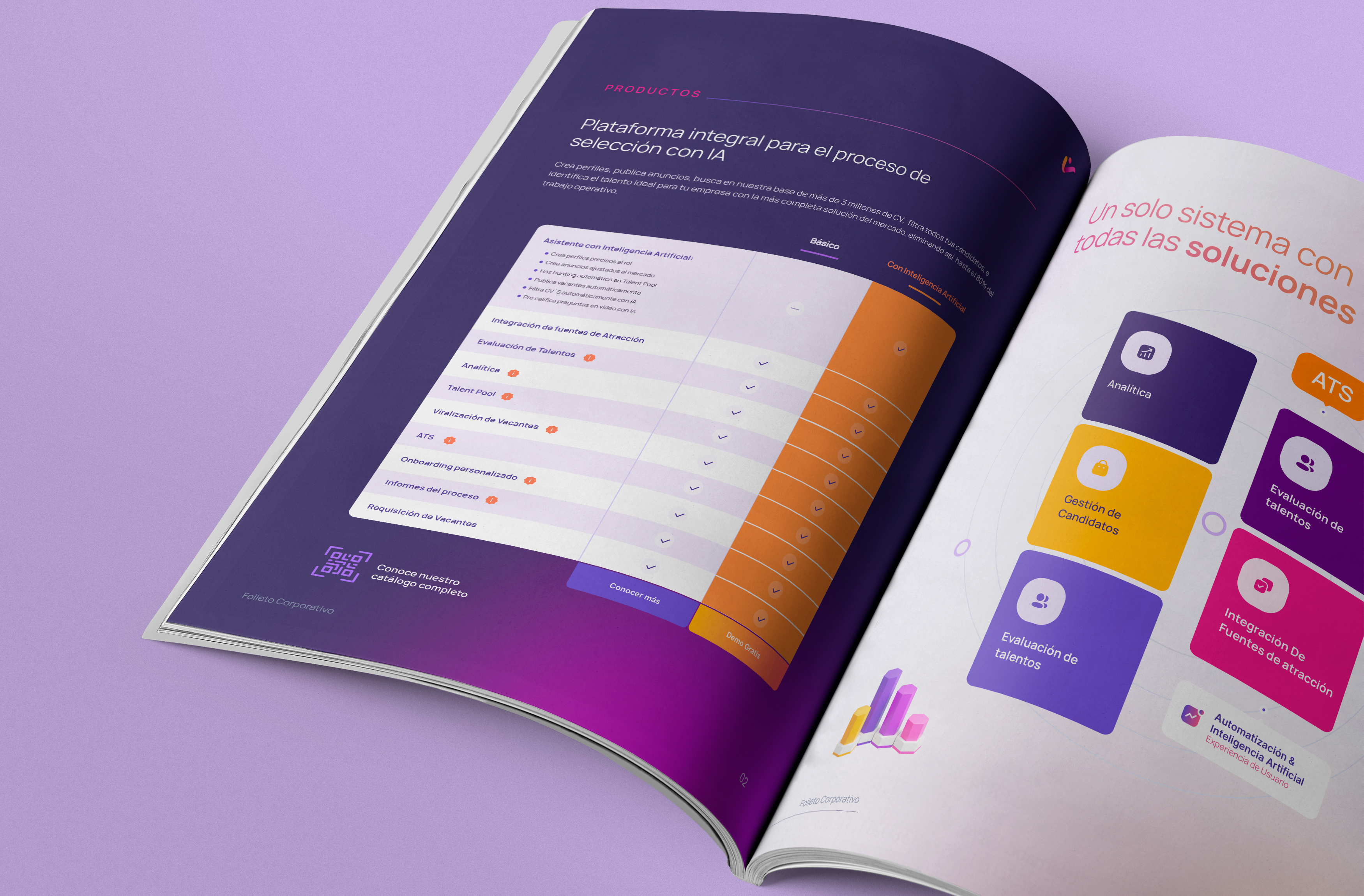
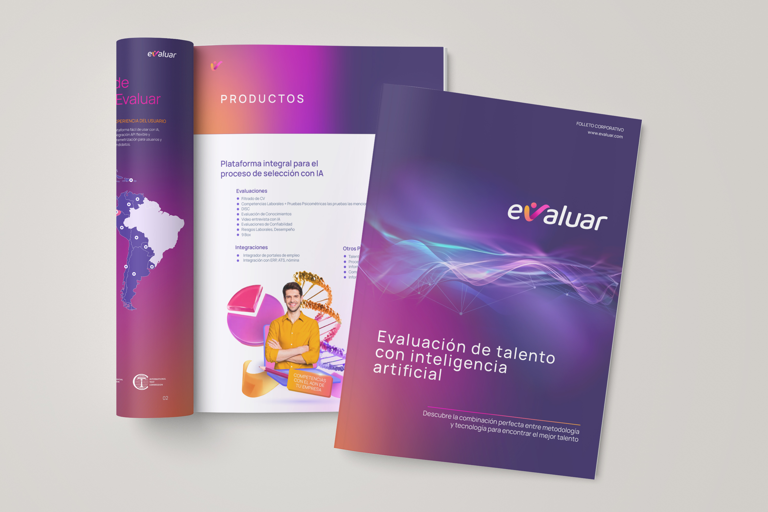
We reorganised information, flows and hierarchy so ATS, assessments, talent sourcing, analytics and AI were easy to understand.
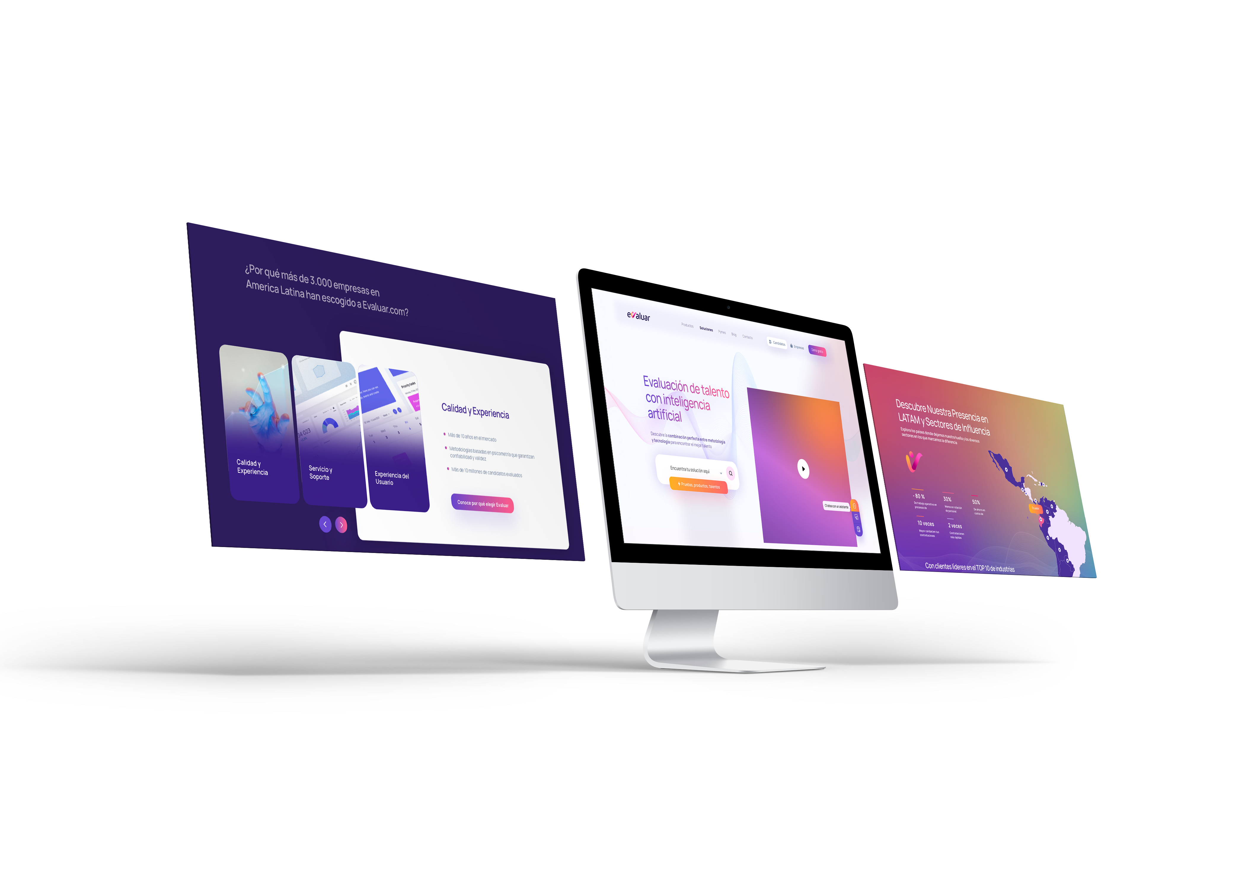
We designed a clear, trustworthy web experience with a distinctive direction: livelier, more current and less generic than traditional corporate software.
The visual system can extend to new sections, products and campaigns while keeping brand, product and communication coherent.
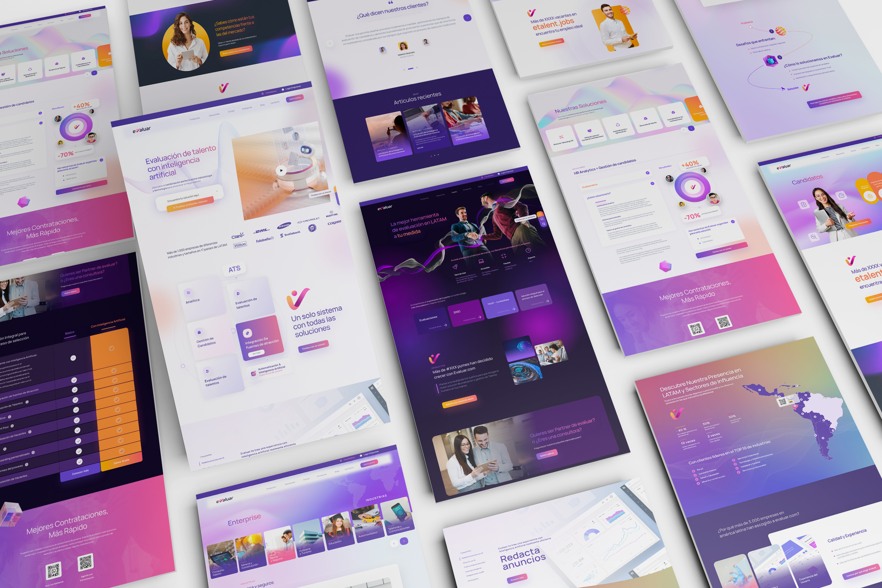
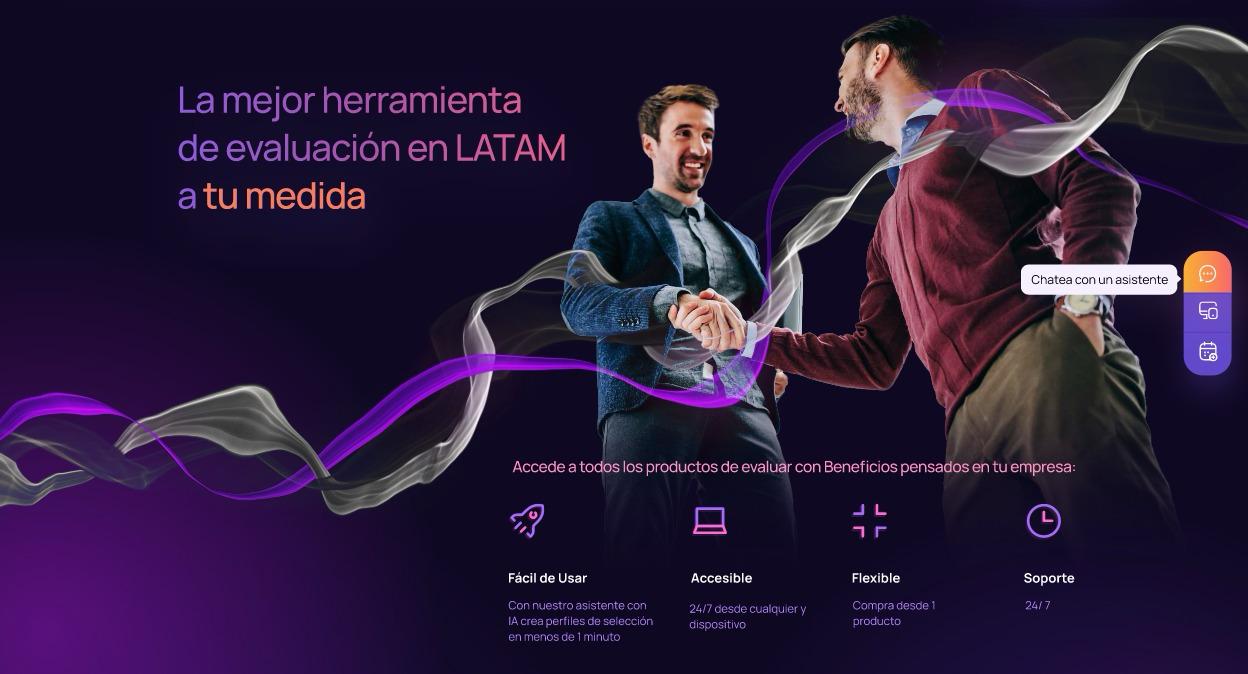
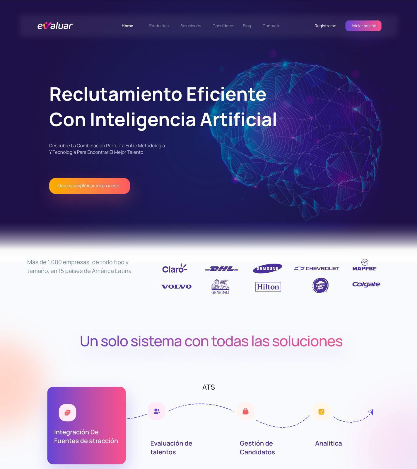
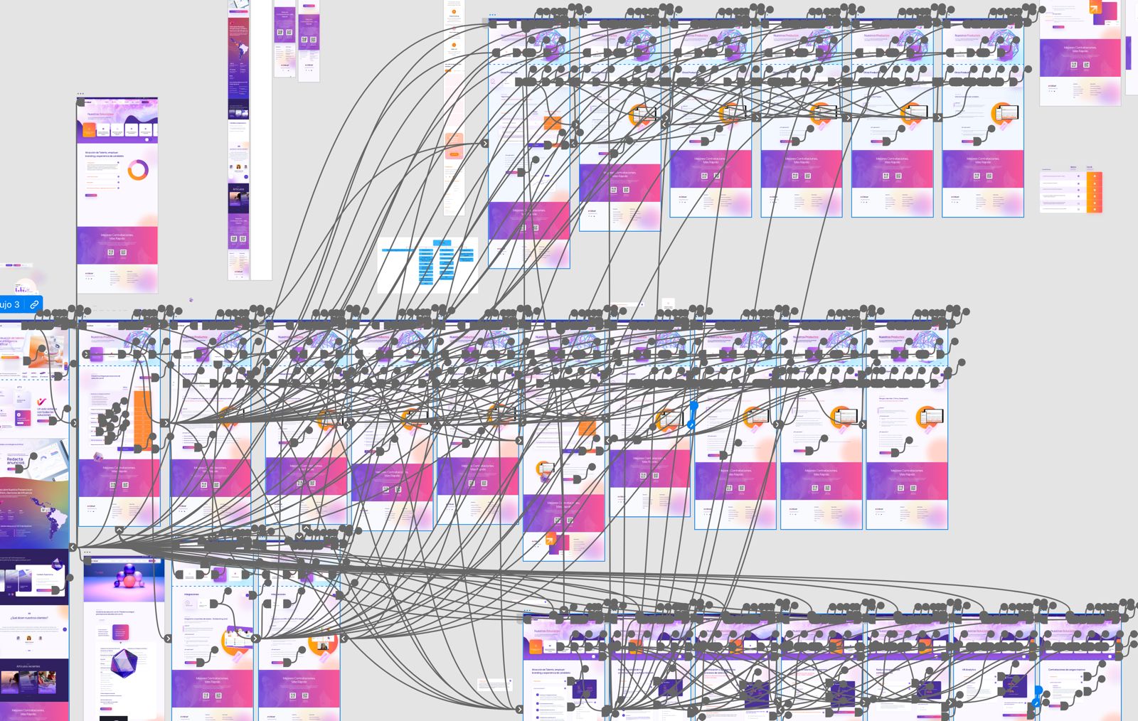
We renewed Evaluar with a more modern, coherent and recognisable visual system across every touchpoint.
The development team received a documented visual system to implement interfaces with greater clarity and less friction.
The new web experience helps organise the offer, reduce confusion and present services more clearly to corporate clients.
We designed a clean, commercial digital experience with a more vivid, modern and distinctive visual direction.
Corporate branding, logo redesign, brand guidelines, visual direction, UX/UI, web architecture and design system.
Adobe Illustrator, Adobe XD, Figma, Adobe Photoshop e InDesign.
“When I reviewed evaluar.com’s evolution, I understood the challenge was to update the brand without erasing its history.
The vision was to keep its ideas of assessment, progress and trust, while taking them into a more contemporary language: an identity with more life, a strong corporate presence and a clear, creative interface ready to scale.
Business software can feel human, modern and exciting to use, too.”
Branding, UX and Product Designer at LIMINAL

“Working with LIMINAL completely transformed our market presence. They translated a complex software platform into a visually clean, intuitive experience that builds immediate trust with Human Resources teams.”
evaluar.com
Evaluar evolved from a functional identity into a more vivid, technological and scalable visual system.
The project aligned brand, product and digital experience under one visual direction, creating a clearer, more trustworthy presence ready for new growth scenarios.
If your software is powerful, your image should communicate that too. LIMINAL can help you build an identity, visual system and digital experience that people understand, remember and trust.
Let’s talk about your project